


- bhavya gada
- No Comments
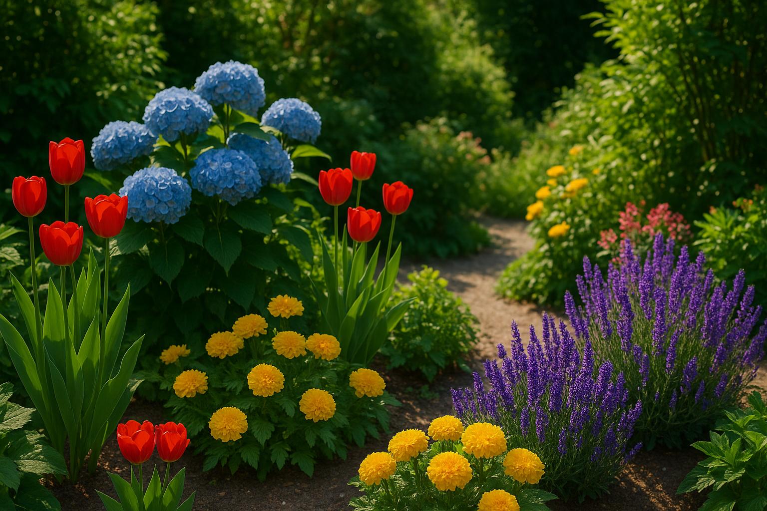
Choosing plants based on color can transform your garden into a cohesive, visually appealing space. By understanding color theory and how different hues affect mood and perception, you can design areas that feel vibrant, calming, or balanced. Here’s the key:
- Warm colors (reds, oranges, yellows) energize and draw attention, perfect for social spaces.
- Cool colors (blues, purples, greens) create a tranquil, spacious feel, ideal for relaxation zones.
- Light hues brighten shady areas, while dark tones add depth to sunny spots.
To maintain interest year-round, plan for seasonal variations with plants that bloom at different times and include foliage for consistent color. Use layering, repetition, and lighting to enhance your design. Whether you prefer a monochromatic look, bold contrasts, or harmonious flow, a thoughtful color palette ensures your garden feels intentional and inviting.
Start by defining your garden’s purpose, match plants to your local environment, and consider bloom timing for continuous color. With these steps, you’ll create a landscape that’s both functional and visually striking.
How to choose a colour scheme for your garden | Grow at Home | RHS

Understanding Color Theory for Gardens
Color theory isn’t just for painters or designers – it’s a powerful way to transform your garden into a cohesive, visually stunning outdoor retreat. By learning how colors interact, you can plan a garden that feels deliberate and well-thought-out, instead of a random mix of plants.
The principles of garden color theory borrow heavily from art and interior design. Colors naturally relate to one another, and these relationships play a big role in whether your garden feels balanced or disorganized. Once you understand the basics, choosing plants and flowers becomes much more intentional. Let’s break down how warm and cool colors shape the mood and atmosphere of your garden.
Warm vs. Cool Colors
Warm colors – reds, oranges, yellows, and pinks – are the attention-grabbers of the garden. These bold, fiery tones seem to leap forward visually, making spaces feel closer and more intimate. They’re full of energy and evoke emotions like enthusiasm, passion, and playfulness. Warm colors are ideal for areas where you want to create a lively, social vibe, perfect for entertaining or sparking conversation.
On the flip side, cool colors – blues, purples, silvers, and greens – bring a sense of calm and depth. These hues tend to recede, creating the illusion of distance and making spaces feel more expansive. Cool tones are soothing, evoking images of tranquil skies, serene waters, and peaceful forests. They’re perfect for spots in your garden meant for relaxation and quiet reflection.
By combining warm and cool colors, you can design gardens that feel dynamic and layered. Warm tones can energize a space, while cool tones balance the mood, adding a sense of tranquility. This balance helps you tailor specific areas of your garden to different purposes, whether it’s a lively gathering space or a meditative retreat.
Practical tips bring these ideas to life. For a calming meditation area, try soft combinations of blue, lavender, and white. If you’re designing a space for entertaining, go for bold, energizing colors like red, orange, and yellow. In shady areas, cool colors like green and blue create a refreshing vibe, while warm tones like yellow and chartreuse can brighten dim corners.
Use warm, vibrant colors like red and orange sparingly to avoid overwhelming the design. These shades work well as accents or focal points, naturally drawing the eye. Red, in particular, is excellent for creating standout features. Meanwhile, cool tones like green foliage provide a neutral backdrop, balancing the vibrancy of warm colors and letting them shine without overpowering the space.
Color Schemes for Gardens
Once you understand how colors influence mood, you can take it a step further by using specific color schemes to guide your garden design. These schemes help you create intentional, visually appealing combinations that work seamlessly together.
Monochromatic schemes focus on a single color family, using different shades and textures for variety. For example, an all-white garden could feature cream roses, white hydrangeas, and plants with silvery leaves. Or, a purple garden might include lavender, deep purple salvia, and light purple asters. This approach creates a serene and elegant look with subtle depth.
Complementary schemes pair colors that are opposite each other on the color wheel, such as purple and yellow or red and green. These combinations are bold and high-contrast, adding energy and drama to your garden. Picture purple catmint alongside yellow coreopsis or red geraniums surrounded by lush green foliage for a striking effect.
Analogous schemes use colors that sit next to each other on the color wheel, like blue, purple, and pink or yellow, orange, and red. These combinations feel harmonious and natural, creating a smooth, flowing look. A garden featuring blue delphiniums, purple lupines, and pink roses is a great example of this approach.
Each scheme sets a different tone: monochromatic gardens feel peaceful and sophisticated, complementary gardens are vibrant and energizing, while analogous gardens offer a gentle, flowing aesthetic. Your choice depends on the mood you want to create and how you plan to use the space.
No matter which scheme you choose, varying the intensity and shade of your colors is key. Mixing lighter and darker tones, along with different textures and plant sizes, adds depth and interest – even within a single color family. This attention to detail ensures your garden feels layered and visually engaging.
How to Select Plants Based on Color
Building on color theory, the next step is choosing plants that reflect your desired mood and can thrive in your local environment. This process involves understanding your garden’s purpose, considering local growing conditions, and planning for year-round color.
Decide on a Mood or Theme
Start by defining the mood or theme you want your garden to convey. This choice will guide your color palette and help create a harmonious space that fulfills its purpose.
For a calming retreat, stick to cool, soft hues. Imagine a peaceful reading corner surrounded by white gardenias, pale blue hydrangeas, and silver dusty miller. In shaded areas, white caladiums, green hostas, and pale purple astilbe make for a tranquil setting.
Energizing social spaces thrive on warm, vibrant tones. Picture a lively patio bordered by red salvia, orange marigolds, and yellow rudbeckia. For an inviting walkway, consider hot pink petunias paired with coral begonias.
Romantic gardens shine with soft pinks, deep purples, and creamy whites. Combine pink roses, lavender, and white sweet alyssum for a dreamy atmosphere. For evening gardens, white moonflowers and night-blooming jasmine offer fragrance and elegance.
Modern and sophisticated designs often feature monochromatic schemes or bold contrasts. An all-white garden with white roses, peonies, and silvery artemisia creates a sleek, elegant look. For drama, pair dark purple petunias with bright white impatiens.
Once you’ve chosen a theme, ensure the plants you select align with your garden’s specific environmental conditions.
Match Plants to the Environment
The success of your plants depends on their compatibility with your garden’s conditions. Choose varieties that not only meet your color goals but also thrive in your local environment.
Sun exposure is a key factor:
- Full sun (6+ hours): Red geraniums, orange nasturtiums, yellow coreopsis
- Partial shade (3–6 hours): Pink impatiens, purple coleus, white begonias
- Full shade (less than 3 hours): Burgundy heuchera, chartreuse hostas, silver pulmonaria
Soil type is equally important. Most flowering plants prefer well-draining soil, but clay soil is better suited for moisture-tolerant options like purple Louisiana iris and yellow flag iris. Sandy soil supports Mediterranean plants like lavender, silver sage, and yellow santolina.
Climate zones also play a role in plant selection. For example, in USDA Zones 6–7 (common in Maryland), reliable perennials include purple coneflowers, yellow black-eyed Susans, and red bee balm.
Native plants are another excellent choice. They not only provide vibrant color but also support local wildlife. In the Mid-Atlantic region, options like purple wild bergamot, yellow wild indigo, and white wild ginger are hardy and require minimal care.
Finally, test your soil’s pH. For instance, acidic soil enhances blue hydrangea blooms, while alkaline soil turns the same flowers pink. Once you’ve matched your plants to your local conditions, plan for continuous color throughout the year.
Include Seasonal Color Variations
To keep your garden visually appealing, plan for plants that bloom in different seasons. This ensures your chosen color scheme stays vibrant from spring to fall.
Spring bloomers bring early pops of color with white daffodils, pale yellow tulips, purple crocuses, and pink cherry blossoms, setting the stage for summer.
Summer plants are the backbone of your design, providing continuous color. Red petunias, orange zinnias, yellow marigolds, purple salvia, and pink vinca bloom steadily from June through September with regular care.
Fall plants extend the season with purple asters, yellow chrysanthemums, burgundy fountain grass, and repeat-blooming roses adding fresh waves of color into October.
Foliage plants ensure consistent color even when flowers fade. Burgundy coleus offers rich red tones all season, while chartreuse sweet potato vine adds brightness. Silver dusty miller serves as a neutral complement to any color scheme.
Succession planting keeps annuals looking fresh. For example, replace early-season purple pansies with heat-tolerant purple petunias as summer approaches.
Winter interest can maintain color in dormant months. Red-twig dogwood adds striking red accents, while holly berries stand out against evergreen foliage, ensuring your garden remains vibrant year-round.
sbb-itb-843f8be
Design Tips for a Balanced and Colorful Garden
Once you’ve settled on a clear color scheme, these design tips can help refine your garden’s overall structure. Thoughtful plant arrangement and smart design techniques can turn a collection of colorful plants into a well-organized, eye-catching landscape that leaves a lasting impression.
Layering Plants for Depth
Layering plants is a great way to add depth and dimension to your garden. This involves arranging plants based on their mature height, bloom timing, and foliage characteristics to create a dynamic and visually appealing space.
Start with height arrangement as the foundation. Place tall plants, like 6-foot purple Joe Pye weed or yellow Jerusalem artichoke, at the back of borders. Medium-height plants such as 3-foot red bee balm or orange butterfly weed work well in the middle, while low-growing options like white sweet alyssum or purple ajuga should go in the front. This ensures all plants are visible and well-framed.
Texture contrast is another key element for visual interest. Pair plants with fine textures alongside those with bold, striking shapes. For example, delicate purple Russian sage contrasts beautifully with broad-leafed purple heuchera, while feathery yellow fennel complements sturdy yellow rudbeckia. These combinations add depth, even when sticking to a single color palette.
To keep your garden engaging throughout the seasons, focus on bloom timing layers. Sequence plants so something is always in bloom, creating continuous interest. Meanwhile, foliage-focused plants like burgundy coleus provide consistent color, acting as a dependable backdrop for seasonal flowers.
Don’t overlook foliage as structure. When blooms fade, plants like silver artemisia offer a neutral backdrop that enhances vibrant colors, while chartreuse hostas brighten shady areas and pair well with warm or cool flowers. Dark purple heuchera adds drama, making nearby white or yellow flowers pop.
For a more natural and cohesive look, plant in odd-numbered groups of three, five, or seven. For instance, a cluster of five white astilbe creates a stronger visual impact than scattering single plants around a shade garden.
These layering techniques naturally lead into strategies for using repetition and color balance to unify your garden’s design.
Repetition and Color Balance
Building on layered depth, repetition helps anchor your garden’s design. By thoughtfully repeating colors and plant forms, you can create a sense of unity while keeping the space visually engaging.
Color echoing is a simple way to guide the eye through your garden. For example, if you plant purple salvia near your front entrance, repeat that purple with distant patches of lavender or purple coneflowers. This creates a sense of flow and intentionality.
Similarly, plant repetition strengthens the design. Placing white hydrangeas at three points around a patio establishes rhythm and cohesion. Repeating clusters of yellow daylilies along a walkway provides consistent color anchors throughout the season.
To keep the design balanced, focus on proportional color balance. Choose a dominant color, a secondary hue, and a small accent shade to avoid overwhelming the eye. This approach creates harmony while maintaining variety.
Seasonal balance is also crucial. If your spring garden leans toward cooler tones like purple pansies and white daffodils, warm it up in summer with yellow marigolds and orange impatiens to match the season’s brighter energy.
Neutral anchors help tone down bold colors. Plants like dusty miller, lamb’s ear, and silver artemisia act as buffers between vivid blooms. Green foliage plants like hostas, ferns, or ornamental grasses provide visual rest and contrast against vibrant flower displays.
Use Lighting and Space
Lighting and spatial considerations can enhance the impact of your garden design. Light affects how colors appear, so understanding your garden’s lighting conditions can help you position plants for maximum effect.
In morning light, pastels appear soft and glowing. White flowers like morning glory or moonflower seem luminous, while pale pink roses and lavender catmint take on a romantic quality.
Afternoon sun, on the other hand, intensifies vibrant colors. Bright red geraniums, orange marigolds, and yellow sunflowers thrive in this light, appearing bold and energetic. However, pale colors may wash out under the strong rays.
For evening and shaded areas, lighter colors are more effective. White nicotiana, pale yellow evening primrose, and silver-leafed plants stand out as daylight fades. Darker plants like deep purple petunias or burgundy coleus tend to recede in low light.
Dappled shade under trees creates shifting light patterns that make certain plants sparkle. White caladiums, chartreuse heuchera, and pale pink begonias reflect filtered sunlight, adding brightness to dim spaces.
Space considerations also play a role in color perception. Bright, bold colors like hot pink, orange, and yellow can make small gardens feel more enclosed, while cooler tones like blue, purple, and soft pink create a sense of distance and openness.
Finally, background colors influence how plants are perceived. Dark backdrops, such as evergreen shrubs or wooden fences, make light-colored flowers stand out, while light-colored backgrounds like pale stone walls or white fences enhance the richness of dark plants like burgundy coleus or purple heuchera.
Professional designers often suggest observing your garden at different times of day during the planning phase to understand how light and shadows affect your color choices across the seasons. Combining these lighting and spatial strategies with layering and repetition will help you create a garden that feels both harmonious and impactful.
Conclusion: Bringing It All Together
A well-planned, color-coordinated garden can turn a random assortment of plants into a thoughtfully designed landscape that reflects your personal style. By following the steps we’ve discussed – grasping color theory, choosing the right mood, factoring in the environment, and planning for the seasons – you can create a garden that feels both intentional and visually striking. This method provides a foundation for a space that remains beautiful year after year.
Start by defining your vision – whether that’s a soothing analogous palette or a bold complementary scheme – to guide your decisions. Great gardens often evolve through trial and error, allowing you to create something that feels uniquely yours.
Consider layering plants by height and texture, repeating colors to create flow, and using light to enhance the overall harmony of your garden. These techniques ensure your space feels cohesive rather than chaotic.
Building on seasonal strategies, aim for plants with staggered bloom times and foliage that offers consistent color throughout the year. This approach ensures your garden remains vibrant and inviting no matter the season, transforming it into a space you’ll enjoy year-round.
Above all, remember that gardens are living, ever-changing spaces. As plants grow and seasons shift, your preferences might change too. The best gardens adapt over time while staying true to their core design and color story.
Work with Pro Landscapes MD for Expert Guidance

If you want to bring this vision to life with ease, Pro Landscapes MD offers the expertise you need. Their team specializes in plant selection, color theory, and understanding Maryland’s unique growing conditions. They can help you avoid common pitfalls, like overloading your garden with too many colors or choosing plants that aren’t suited to your site.
Serving communities across central Maryland – including Howard, Montgomery, Carroll, Frederick, Prince George’s, and Baltimore counties – Pro Landscapes MD provides more than just plant selection and garden design. They also offer full landscaping services, from hardscaping and drainage solutions to eco-friendly options. Whether you’re dreaming of patios, walkways, or serene water features, they can integrate these functional elements into your color-coordinated garden.
Ready to transform your outdoor space into a vibrant, expertly designed retreat? Visit prolandscapesmd.com to explore their range of services, browse project galleries, and schedule a consultation. Their team can help you create the stunning, sustainable garden you’ve always envisioned, tailored to your preferences and Maryland’s growing conditions.
FAQs
How can I keep my garden colorful all year round, even with changing seasons?
To keep your garden lively and colorful all year, select a combination of plants that thrive in different seasons. Start with evergreens like holly or conifers to provide consistent greenery and add visual interest during the winter months. For a touch of brightness in colder weather, consider plants with winter berries or those with interesting textures, such as ornamental grasses.
For seasonal bursts of color, include perennials that bloom across spring, summer, and fall – think tulips, daisies, and chrysanthemums. By layering plants with staggered bloom times, you can ensure your garden always has something vibrant to offer. This approach not only keeps your outdoor space dynamic but also makes it a welcoming sight no matter the time of year.
How can I balance bold and neutral colors in my garden to create a harmonious design?
To design a garden that feels both inviting and balanced, begin with a neutral base – think shades of green, white, or gray. These tones create a soothing backdrop that sets the stage for other elements. To make specific areas stand out, use bold colors sparingly as accents, ensuring they draw attention without overpowering the overall design. Mixing different textures and patterns can also bring in layers of visual interest, tying everything together seamlessly.
A great tip to follow is the 60-30-10 rule: allocate 60% of the garden to neutral tones, 30% to complementary secondary colors, and just 10% to striking accents. This approach keeps the space balanced and prevents it from feeling cluttered. Before committing to a design, experiment with color combinations and factor in how natural light interacts with the space. These small adjustments can make a big difference in creating a garden that feels both vibrant and harmonious.
How does lighting impact plant colors in my garden, and how can I use it to improve my design?
Lighting has a powerful influence on how the colors in your garden are perceived. Natural light shifts throughout the day and across seasons, which means the same plants can look different depending on the time. In the soft light of morning or evening, warm colors like reds and oranges tend to glow, creating a rich and inviting scene. On the other hand, the bright midday sun often brings out the crispness of cooler tones like greens and blues.
You can also use outdoor lighting to enhance your garden’s appearance after sunset. By placing lights thoughtfully, you can draw attention to specific plants or focal points. Warm-toned lights are perfect for creating a cozy, welcoming vibe, while cooler lights can make greenery pop with vibrancy. When used well, lighting not only highlights your garden’s best features but also adds layers and harmony to the overall design, ensuring it looks stunning no matter the time of day.
Chat with Us