









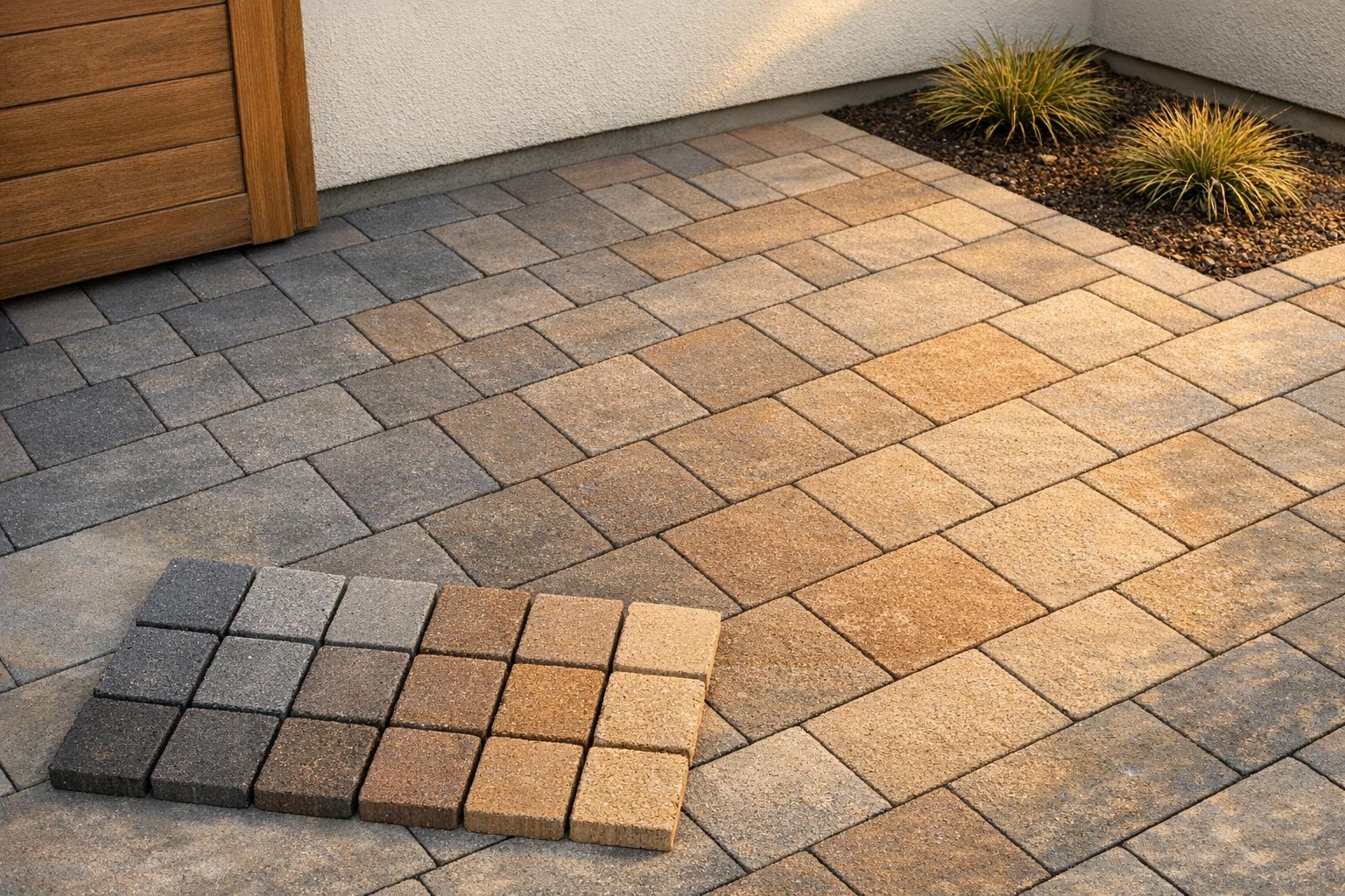
- bhavya gada
- No Comments
Mixing colors in paver designs can transform your outdoor space, making it visually appealing and functional. By carefully selecting and combining colors, you can highlight key areas, complement your home’s exterior, and even hide dirt or stains. Here’s how to get it right:
- Understand Color Tones: Warm tones (e.g., tan, beige) create a cozy feel, while cool tones (e.g., gray, slate) suit modern aesthetics. Match colors to your home’s exterior for a cohesive look.
- Evaluate Undertones: Identify subtle hues (yellow, red, blue) in materials like brick or siding to ensure harmony.
- Create a Palette: Use one dominant color (60–80%), a darker border (15–30%), and optional accents (5–10%) for balance.
- Test Before Committing: Dry-lay a sample section and observe it in different lighting conditions.
- Choose Patterns Wisely: Use simple layouts for bold contrasts or blended pavers for a natural look. Borders and accents add structure.
- Consider Maryland’s Climate: Use durable materials for freeze-thaw cycles and lighter colors for sunny areas.
Proper planning and installation ensure your design looks great and lasts for decades.
Blending Paver Colors for Stunning Results
sbb-itb-843f8be
Paver Color Selection Basics
Choosing the right paver color is about more than picking a shade you like – it’s about understanding how colors interact with your home’s exterior. A paver that looks perfect on a sample board might feel completely different when placed next to your home’s brick, siding, or roof. To get it right, consider three key aspects: temperature (warm or cool tones), undertone (the subtle secondary hue), and how these factors complement your home’s materials. Let’s break it down.
Warm vs. Cool Tones
Warm tones – like tan, buff, beige, sand, brown, and clay – bring a cozy, inviting feel. These colors are perfect for family patios, fire pits, or homes with a traditional style, where you want the hardscaping to blend seamlessly with the house.
On the other hand, cool tones – such as light gray, charcoal, bluish-gray, and slate – offer a sleek, modern aesthetic. They’re particularly effective in smaller spaces, as they can create an airy, open feel. Cool tones pair beautifully with contemporary designs, black-framed windows, and stainless steel outdoor kitchens.
One thing to keep in mind: darker colors like deep charcoal or brown absorb more heat, which might make them less comfortable for areas with full sun. If you’re working with a sunny spot, lighter shades like tan, buff, or light gray are often better choices.
Undertones in Paver Colors
Undertones are the subtle hues that sit beneath the main color. For example, a paver might lean toward a yellow/golden, red/rust, or blue/cool undertone. These can be hard to spot in a showroom but become noticeable when placed next to your home.
Here’s a quick trick: take the paver outside and compare it against a white sheet. This will help reveal any yellow, pink, or blue tones. If you’re comparing several "gray" pavers, the one that looks slightly blue has a cool undertone, while one that appears tan or khaki has a warm undertone.
Matching undertones is crucial for a cohesive look. For instance, pairing a red-orange brick façade with a blue-undertone gray paver can create a jarring contrast. When mixing paver colors, stick to a single undertone family – either all warm, all cool, or all neutral – for a harmonious design.
Matching Paver Colors to Maryland Home Styles
Maryland’s variety of home styles means there’s no one-size-fits-all solution for paver colors. Start by identifying your home’s dominant exterior material and its temperature, then select pavers that complement that palette. Here’s a handy guide:
| Home Style | Common Exterior | Recommended Paver Direction |
|---|---|---|
| Brick Colonial | Red/orange brick, white trim | Warm tan, buff, or charcoal with a brown undertone |
| Craftsman / Stone Front | Mixed gray-tan stone, shake siding | Earth tones, greige, or blended tans that echo the stone |
| Traditional Suburban Siding | Beige or taupe vinyl/fiber-cement | Tan, light brown, or greige in a matching undertone |
| Modern / Contemporary | Gray or white exterior, black trim | Cool gray, charcoal, or slate with a blue or neutral undertone |
Roof color also plays a big role. A warm brown or weathered wood shingle works best with warm or neutral pavers, while black or cool gray roofing pairs better with cool tones. As for white or off-white trim? It’s flexible enough to work with either palette. Just make sure no element clashes with the overall design.
Building Your Multi-Color Paver Palette
Reading Existing Site Colors
Before selecting your pavers, take a close look at the colors already present on your property. Start with the largest surfaces – like your siding, brick, roofing shingles, and foundation. From about 20 feet away, determine if these elements lean warm (beige, tan, cream, or brown) or cool (gray, blue-gray, or charcoal). Then, move on to secondary features, such as your trim, shutters, garage door, and any existing concrete steps or walkways.
Even mulch can play a role in your palette. For instance, reddish-brown mulch complements warm tones, while black mulch pairs well with cool grays. The idea is to identify 3–5 recurring colors on your property that can serve as the foundation for your paver palette. Once you’ve pinpointed these shades, you can start defining your dominant and accent colors.
Picking Dominant and Accent Colors
When creating your paver design, stick to a simple color scheme: one dominant field color, one border color, and optionally, a small accent. A good balance is 60–80% field, 15–30% border, and 5–10% accent. For the field, choose a mid-tone that complements your siding or brick without overpowering it. Next, select a border color that’s one or two shades darker but stays within the same color family. For example, a warm tan field pairs well with a deep brown or dark warm-gray border. If you decide to add an accent, draw from an existing element of your home, like the shutters, roof, or front door, to make the design feel intentional.
As Belgard/ICPI design experts note, about 90% of successful paver designs use just one main color with one accent or border color. Adding too many colors can make a patio look busy or mismatched.
Here’s how this approach might look with different Maryland home styles:
| Home Style | Field Color | Border Color | Accent |
|---|---|---|---|
| Red-brick Colonial (Columbia, Ellicott City) | Warm gray–tan blend | Deep charcoal or brown | Narrow dark brown or red band |
| Vinyl-sided Colonial (Germantown, Olney) | Light tan or buff blend | Medium to dark brown | Optional; subtle warm gray soldier course |
| Modern farmhouse (Howard/Montgomery Counties) | Cool light gray | Rich charcoal | Restrained linear inlay in slightly warmer gray |
Blended Pavers vs. Solid Color Combinations
Once you’ve established your color hierarchy, think about the paver composition. Blended pavers incorporate multiple pigments into each unit, with tones like tan, brown, and charcoal flecks creating a natural, stone-like look. This variation not only enhances texture but also helps hide dirt and stains. They’re a great choice for larger areas like driveways or patios, especially when paired with simple patterns like running bond or herringbone. The texture brings enough visual interest without needing complex designs.
Solid color pavers, on the other hand, offer precise control. Each unit is a single, uniform color, making them ideal for sharp contrasts, clean banding, or geometric inlays. However, solid colors – particularly lighter or darker shades – tend to show stains, pollen, and efflorescence more clearly. To balance aesthetics and practicality, many projects combine the two: a blended field paver with solid border pavers [1]. This approach gives you a natural-looking surface framed by crisp, defined edges, offering both design flexibility and easier maintenance.
Patterns and Layouts for Multi-Color Pavers
Field Patterns and Borders
After deciding on your color hierarchy, the pattern you choose plays a big role in how those colors work together. For example, herringbone patterns – whether set at 45° or 90° angles – are ideal for driveways and high-traffic paths. This interlocking layout resists shifting under vehicle weight and creates a structured look that makes any color variations feel deliberate. On the other hand, running bond and ashlar (modular) patterns are more relaxed and work beautifully for patios and walkways, especially when paired with blended multi-tone pavers.
If you’re leaning toward a more intricate pattern, stick to colors with closer tonal values. A busy herringbone design with small pavers benefits from subtle tones to keep the layout clear. However, if bold color contrasts are your goal, simpler patterns like running bond or large-format ashlar give the eye room to appreciate both the design and the color shifts.
Borders serve as visual frames that define and contain a space. A common choice is a soldier course, where pavers are laid lengthwise along the edges in a slightly darker shade. This anchors the design and prevents the multi-color field from looking unfinished at the edges. For a more formal touch, consider a double border: an outer dark course paired with a medium-tone inner course. This approach adds structure without needing a third field color and naturally guides the placement of your chosen colors.
Where to Place Each Color
Once your pattern is set, placing colors thoughtfully ensures balance and clarity. Start with a mid-tone blend for the largest area, as it’s versatile and forgiving. Use a darker shade for the border to visually anchor the edges and help define pathways or transitions. For accents, stick to small, repeatable areas – like a narrow inner band, corner details, or step edges – to avoid overwhelming the design.
Symmetry can make a big difference. For example, repeating the same border treatment on both sides of a walkway or using the same accent band around all sides of a patio creates a cohesive, intentional look. Randomly placed accents, on the other hand, can lead to visual clutter, so it’s best to keep them consistent and deliberate.
Practical Color Placement Tips
While aesthetics are important, function should also guide your color choices. In sunny areas – like patios, pool decks, or south-facing spaces – lighter paver tones stay cooler underfoot. Darker pavers can reach temperatures of 120–150°F on sunny days, whereas lighter shades remain noticeably cooler, which is a big plus during hot Maryland summers when bare feet meet hot surfaces.
A helpful rule of thumb is to let color act as a supporting feature rather than the star of the show. A simple pattern with a limited color palette allows one element to take center stage. You can then add visual interest through texture, border details, or a subtle second tone – without introducing too many unrelated colors that could overwhelm the design.
How to Mix and Install Multi-Color Pavers: Step by Step
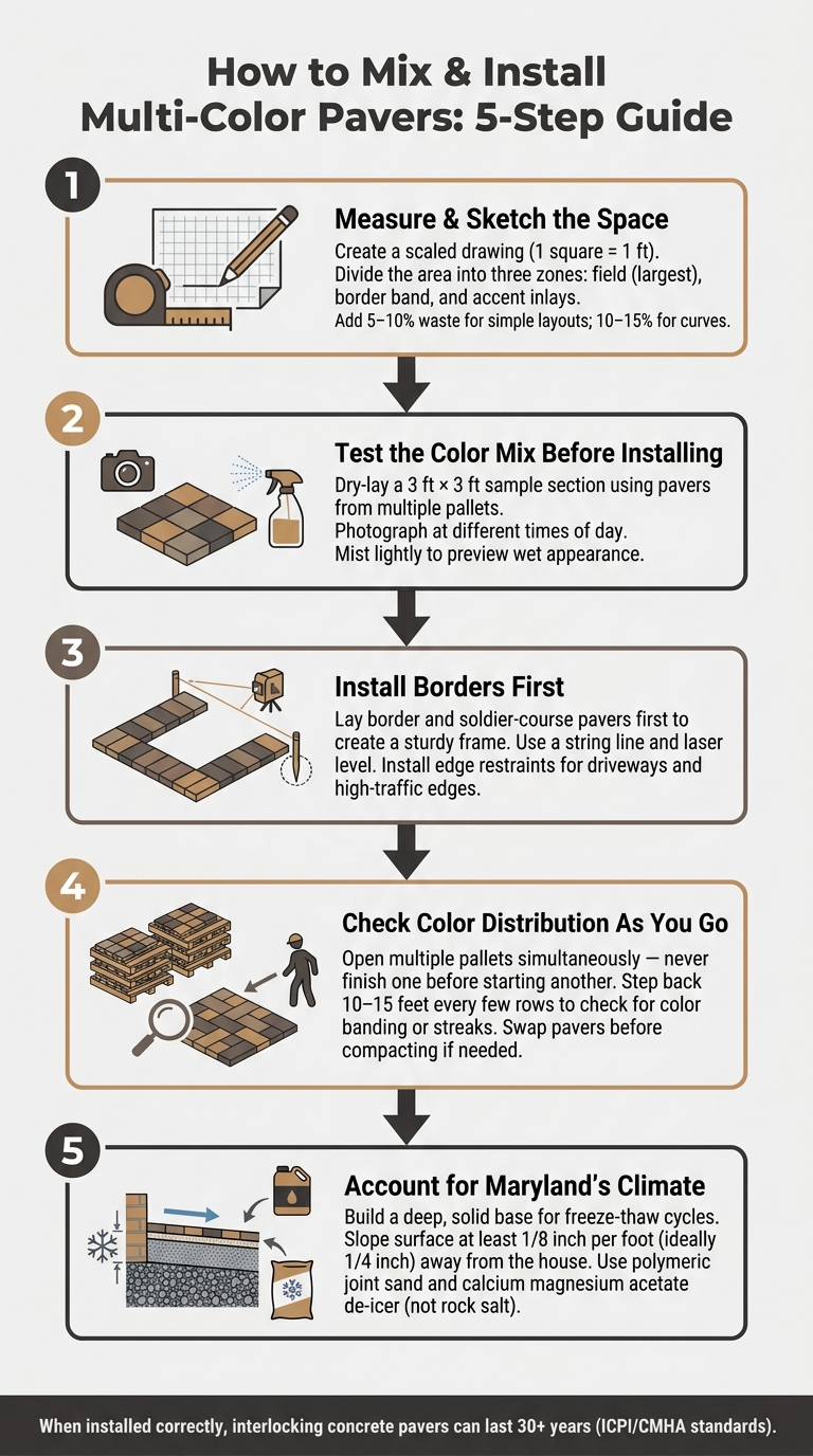
How to Mix & Install Multi-Color Pavers: 5-Step Guide
Once you’ve chosen your colors and planned your pattern, it’s time to install your multi-color pavers. Here’s a detailed guide to help you get it done right.
Step 1: Measure and Sketch the Space
Start by creating a scaled drawing on graph paper, where 1 square equals 1 foot. Measure the entire area, noting features like door thresholds, downspouts, steps, or planting beds. Break the space into three zones on your sketch: the field area, the border band, and any accent inlays, and label each with its dimensions.
Calculate the square footage for each zone, and don’t forget to account for waste. Add 5–10% extra for simple layouts and 10–15% for curves or intricate designs. For example, if you’re installing a 200 sq ft patio (160 sq ft field and 40 sq ft border), order about 10% more materials. For a blended field – e.g., 60% light gray and 40% dark gray – you’d multiply each percentage by the field area and add waste. In this case, 160 × 0.6 × 1.1 equals roughly 106 sq ft of light gray, and 160 × 0.4 × 1.1 equals about 70 sq ft of dark gray. Always round up to the nearest full pallet to avoid running out mid-project.
Step 2: Test the Color Mix Before Installing
Before committing to the full layout, dry-lay a 3 ft × 3 ft sample section using pavers from multiple pallets. This helps you see how the colors blend in your chosen pattern. Look for any clumps of one color, streaks, or areas that seem too visually busy.
Take photos from different angles and at various times of day. Morning and afternoon light can make the same pavers appear different, and lightly misting them will show how they’ll look when wet – important for rainy seasons. Adjust the layout as needed before moving on.
Step 3: Install Borders First
With your base and bedding sand ready, start by laying the border and soldier-course pavers. This creates a sturdy frame that keeps the layout straight and prevents the field from shifting as you work. Use a string line and tools like a laser level to ensure corners are square and lines are aligned with the house or other key features.
Double-check transitions at door thresholds, steps, and walkways to avoid awkward gaps or slivers. For driveways or heavily used edges, install plastic or metal edge restraints anchored into the base to prevent movement over time.
Step 4: Check Color Distribution as You Go
To avoid color banding, open multiple pallets and pull from all of them at the same time. Never finish one pallet before opening another. This simple step ensures a balanced color mix throughout the project.
Every few rows, step back about 10–15 feet to review your work. Break the area into smaller sections (about 3 × 3 ft) and check that each section has a consistent mix of colors. If a patch looks too dark or if one color starts forming a streak, swap out a few pavers before compacting. Keep everything loosely set until you’ve done a final check, as it’s much easier to make adjustments now than after the joint sand and compactor have been applied.
Step 5: Account for Maryland’s Climate
Maryland’s freeze-thaw cycles can be tough on pavers, so it’s essential to build a solid base. In areas with clay-heavy soil, like parts of Howard and Montgomery Counties, you might need a deeper base or a French drain to manage water before it freezes beneath the surface.
Make sure the finished surface slopes at least 1/8 inch per foot away from the house, though 1/4 inch per foot is ideal for patios and walkways. Use polymeric joint sand to prevent washout and discourage weeds, and select pavers specifically rated for freeze-thaw durability. For winter maintenance, avoid plain rock salt, which can damage the surface. Instead, use paver-safe de-icers like calcium magnesium acetate to protect both the finish and color.
For projects with challenging drainage or grading, or for permeable paver systems, consider hiring a professional like Pro Landscapes MD. They specialize in paver installations across central Maryland and can ensure your base and drainage are designed to handle local soil and stormwater conditions, giving your project the durability it needs to withstand Maryland’s seasonal changes.
Tying Paver Colors Into the Surrounding Landscape
Choosing the right paver colors isn’t just about aesthetics – it’s about creating harmony with the surrounding environment. By considering how pavers interact with walls, plants, mulch, and even drainage features, you can achieve a well-balanced and visually appealing outdoor space.
Coordinating Colors with Other Hardscape Features
Matching paver tones to other hardscape elements is key to a cohesive design. For example, if your retaining wall has warm buff tones with hints of red, pavers in shades like tan, caramel, or soft red will naturally complement it. Similarly, gray or charcoal pavers work beautifully with cooler gray walls. Mixing warm and cool undertones, however, can create a disjointed look, so it’s best to stay consistent.
A simple way to ensure harmony is by selecting pavers and wall blocks from the same manufacturer’s collection. Brands like Techo-Bloc offer coordinated systems where pavers, wall units, caps, and steps are designed to blend seamlessly in both color and texture.
When designing features like fire pits, outdoor kitchens, or seat walls, treat these as focal points. Use their stone color in the main paver area, and incorporate contrasting tones in borders or inlays for a polished, intentional look. Repeating key colors across different elements ties the entire design together.
How Plantings and Mulch Affect Paver Color
Plants and mulch play a surprisingly big role in how paver colors are perceived. Vegetation, especially, acts as a dynamic backdrop that changes with the seasons. For instance, evergreen shrubs like boxwoods and hollies provide a steady green tone, which enhances the richness of warm paver colors like tan, buff, or clay. In the fall, Maryland’s vibrant foliage – reds, oranges, and golds – can amplify these warm tones but may clash with cooler blue-gray pavers if the design isn’t carefully balanced.
Mulch color also impacts the overall look. Brown mulch pairs well with tan and warm gray pavers, while black mulch creates a striking contrast that complements cool gray or charcoal tones. Be cautious with red-dyed mulch – it can overwhelm the space and compete with red-toned pavers unless the match is spot-on. For multi-color paver blends, natural brown hardwood mulch is often the safest bet as it blends well without overpowering the design.
Groundcovers like creeping thyme or low-growing sedums can soften the edges between pavers and planting beds, making the transition feel more organic and less abrupt.
How Pavers Change Color Over Time
Concrete pavers naturally lighten as they age, interacting with their environment over the years. If you’re aiming for a mid-tone look down the line, consider starting with slightly darker shades to account for this gradual fading. In shaded or damp areas – common in Maryland’s tree-covered backyards – mid-tone and darker pavers also help mask algae growth and leaf stains better than light cream or white tones.
Sealing pavers can slow down color fading, but it requires periodic maintenance, especially in regions like Maryland that experience freeze-thaw cycles. To ensure your design ages gracefully, build your palette around neutral tones with one controlled accent color. This approach keeps the space looking timeless, even as materials weather, plants grow, and outdoor furnishings evolve.
For designs that incorporate drainage features like dry creek beds or French drains, choose decorative stones or river rocks that echo the colors of your pavers and walls. This makes functional elements like stormwater management blend seamlessly into the overall design. Companies like Pro Landscapes MD specialize in coordinating drainage solutions with paver and planting palettes, ensuring the entire outdoor space feels unified.
Conclusion: Getting Multi-Color Paver Designs Right
Creating a stunning multi-color paver design is all about following a clear process: evaluate your site, choose a palette with one dominant color and one or two accents, plan the layout carefully, and test your design on-site before committing. Viewing your sample layout at different times of the day – morning, midday, and evening – helps you catch subtle color shifts that photos can’t fully capture. This extra effort can save you from expensive mistakes down the line.
When installing, it’s essential to pull pavers from multiple bundles at the same time and take a step back every so often – about 15–20 feet – to assess the overall balance. What looks fine up close might appear uneven or patchy from a distance. Adding borders and inlays can help define the space and give even complex designs a polished, intentional look. These steps naturally tie into considerations for how local weather impacts the longevity of your design.
In Maryland, for example, freeze-thaw cycles, sunlight exposure, and tree cover can all influence how paver colors age. Choosing mid-tone or slightly deeper shades during installation helps offset natural fading, ensuring your design remains balanced over time.
Beyond visual appeal, proper installation is key to durability. Issues like uneven base preparation, inconsistent joint spacing, or poor drainage can disrupt your design and shorten the lifespan of your pavement. When installed correctly, interlocking concrete pavers can last 30 years or more, provided they meet ICPI/CMHA standards. That kind of longevity starts with a solid foundation.
For Maryland homeowners ready to bring their vision to life, Pro Landscapes MD offers end-to-end services, from design consultations to precision installations. Their team ensures that the color distribution you plan on paper matches what you see underfoot. With careful planning, thoughtful color choices, and expert installation, you’ll end up with a hardscape that looks fantastic now and continues to perform beautifully for decades.
FAQs
How do I tell if a paver has a warm or cool undertone?
To figure out a paver’s undertone, start by looking at its base color. Warm undertones often include shades like reds, oranges, yellows, and browns, which are typical in brick-style pavers. On the other hand, cool undertones lean toward blues, grays, and silvers, commonly seen in natural stone or concrete options. For the best results, compare the paver against a neutral surface under natural daylight. Pro Landscapes MD offers a variety of materials to help you achieve your design vision.
What’s the easiest way to mix pavers so colors don’t streak or clump?
To prevent color streaks or clumping in your paver project, it’s a good idea to pull stones from several bundles at once during installation. By mixing pavers from at least three pallets, you can create a more natural and evenly blended appearance across the surface. Pro Landscapes MD emphasizes the value of thoughtful planning and choosing the right materials to create smooth, personalized designs for patios and driveways in central Maryland and Washington, DC.
Do I need to seal multi-color pavers to keep them from fading?
The search results don’t clarify if sealing multi-color pavers is required to prevent fading. Pro Landscapes MD uses premium materials, such as Techo-Bloc and natural stone, though specific maintenance practices like sealing aren’t detailed. For tailored guidance on keeping your pavers looking their best, reach out to a professional at Pro Landscapes MD by calling (410) 940-9664.
Chat with Us